

and the internet has been evolving at a breakneck pace. We now have a whole slew of new tools, protocols and web standards.
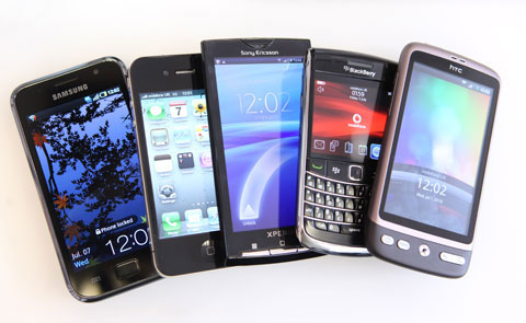
The driving force behind this is the emergence of all the new hardware devices on the market. Most websites haven't kept up with the changes. Computer monitors, processors, smartphones, pads and tablets have increasingly been getting more advanced - especially in the areas of screen resolution and processing power. And, since smartphones are now capable of accessing the web much more efficiently than they were just a couple years ago, more and more people are using their smartphone as a primary internet device. Apple’s IPAD is actually designed from the ground up to be a primary internet device.
Here are the latest numbers as of December 2013:
- 91% of all people on earth have a mobile phone
- 56% of people own a smartphone
- 50% of mobile phone users use mobile as their primary internet source
- 72% of tablet owners purchase online from their tablets each week.
The PROBLEM:
As a direct result of the recent revolutions in technology, most of the websites in existence today are not designed for the smaller screens of these devices, and not only that, many of them cannot be accessed at all, since the navigation menus may be positioned in such a way that they can’t even be seen or accessed when viewed on a handheld device. Nevermind trying to buy something.... if someone can’t even change a page, then you can be assured that no sales will be taking place.
The SOLUTION:
We will take your existing web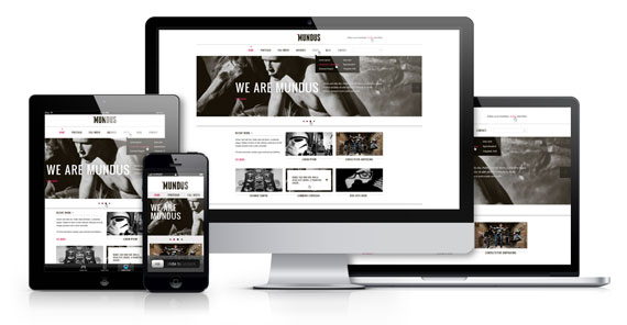 site and ‘remodel’ it so that it is 100% compatible with every major known device out there. We will introduce what’s known as a “responsive framework” which simply means that instead of building multiple websites for each device (which is how it used to be done just a couple years ago believe it or not!) we will build your website using an architecture (or ‘framework’) that responds to whatever type of device or browser that it is being viewed on.
A responsive site has collapsible sections that can be resized and repositioned in different ways depending on the size of the screen. There are also font sizing issues, the navigation structure has to change, the columns have to reposition and realign and the images have to shrink without distorting. All of these things are taken into consideration when creating a responsive website.
Contact us for more information or to get your Free Quote today!


Ищете лучшие финансовые решения? Наш сайт предлагает широкий ассортимент кредитов, банковских карт и займов, чтобы помочь вам достигать ваших целей и воплощать мечты. Хотите купить жилье, автомобиль или оплатить учебу? Наши кредитные программы подходят для любых нужд. Оформите кредит на нашем сайте за несколько минут, выбрав лучшие условия и сроки погашения. Наши банковские карты обеспечивают удобство безналичных платежей и множество бонусов. Получите кэшбэк, скидки у партнеров и участвуйте в программе лояльности. Выберите карту с оптимальными лимитами и условиями обслуживания для себя. Если вам не хватает денег до зарплаты или на неожиданные расходы, наши займы – это быстрое и удобное решение. Мы предлагаем прозрачные условия и мгновенное одобрение заявок, чтобы вы могли решить свои финансовые вопросы без задержек и лишних хлопот. Наши преимущества: простота и удобство – оформление заявки онлайн за считанные минуты; надежность и прозрачность – честные условия без скрытых комиссий; индивидуальный подход – учет ваших личных обстоятельств. Не упустите возможность улучшить свою финансовую ситуацию. Оформите кредит, банковскую карту или займ на нашем сайте уже сегодня и наслаждайтесь всеми преимуществами сотрудничества с надежным финансовым партнером. Сделайте шаг к своим мечтам на нашем сайте!
Кредит на Авто в Копейске